How to Pick the Right Font for Resume Success in 2026
Learn which font for resume wins with ATS and recruiters in 2026. Safe picks, sizing rules, and readability tradeoffs explained in plain English.
If you want one safe default that works almost everywhere in 2026, use Calibri or Arial at 11pt body text with a single heading weight above it. That's the font for resume choice I'd give most job seekers before they overthink anything else.
You're probably staring at a blank document, changing fonts, and trying to decide whether a tiny visual preference can somehow cost you interviews. It can, but not because recruiters are font snobs. It matters because your resume has to work for two audiences at once, ATS software that parses it first, and humans who skim it second. When the typeface is clean, common, and well-sized, both audiences move faster through the page.
Table of Contents
- The One Font Default That Works Almost Everywhere
- How an ATS Reads Your Resume
- The Safe Font List and When to Use Each One
- Font Size, Spacing, and Margins Working Together
- Matching Font and Size to Industry and Seniority
- Fonts and Styles That Quietly Break Your Resume
- Your Pre-Export Typography Checklist
The One Font Default That Works Almost Everywhere
Start with Calibri 11pt or Arial 11pt for body text. If you want the clean default that causes the fewest problems, use one of those and move on. Microsoft's guidance keeps body text in the 10 to 12 point range and name sizing around 18 to 24 points, which matches the practical rule recruiters see over and over, clear hierarchy beats clever design. Microsoft's resume font guidance treats this as a readability decision, not a branding exercise.
Why this default keeps winning
Calibri and Arial are boring in the right way. They're widely available, easy to read at normal resume sizes, and stable when your file gets parsed, exported, or opened on another device. ATS-focused guidance keeps coming back to the same point, plain fonts survive screen review better than decorative ones, and they are less likely to create messy output when a system converts the document. See above for the ATS guidance, the same logic holds there too.
Practical rule: if you are unsure, choose the font that disappears into the background and lets your experience do the work.
That is why I call this a small engineering decision, not a creative one. Your resume is not a poster. It is a machine-readable document that still has to look calm and competent in a recruiter's inbox or PDF viewer.
If you are applying broadly, especially to corporate roles, use the default and move on. You are not buying originality here. You are buying legibility, consistency, and fewer parser problems.
How an ATS Reads Your Resume
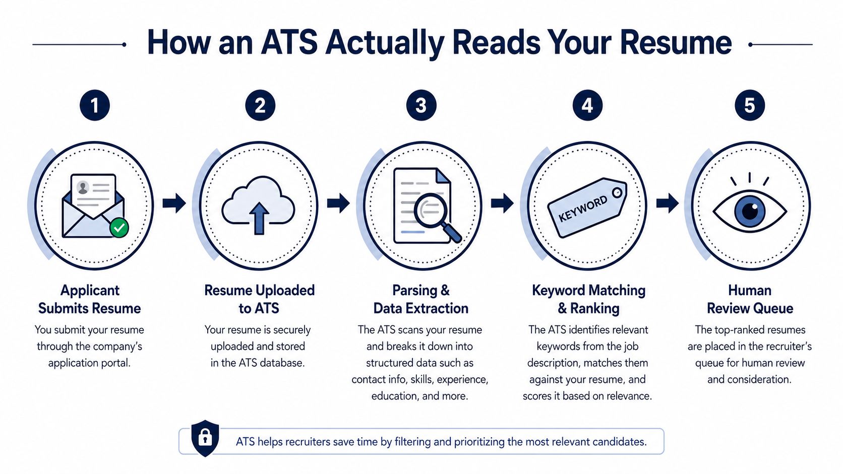
An ATS works like a very fast, very literal librarian. It does not care whether your resume looks artistic. It cares whether it can pull the right fields out of the file, sort them correctly, and hand something readable to a recruiter later. If your font makes letters blur together or renders oddly after upload, the system may still accept the document, but the text can come out scrambled enough to hurt your odds.
The path is straightforward. You upload the file, the system ingests it, then it parses the document into job titles, dates, skills, employers, and other fields. After that, it looks for keywords from the job description and pushes the resume into a review queue for a human recruiter. Clean typography matters because the file has to survive both the software pass and the human pass without extra friction.
Try a free ATS resume checker if you want a quick read on whether your formatting is making parsing harder than it should be.
Where font choice helps or hurts
A font does not usually “beat” an ATS by itself. It helps by keeping letters distinct, spacing stable, and sections easy to extract. Problems start when the font uses decorative strokes, unusual ligatures, condensed shapes, or visual clutter that confuses software. Figma's resume-font guidance warns against unusual ligatures, embedded symbols, and graphical quirks because parsing tools can trip over them, and that kind of failure is exactly what you want to avoid. Figma's resume font guide says the same thing in more practical product language.
A recruiter will forgive a plain resume. They will not forgive a broken one. If the ATS turns clean typography into messy text extraction, your font choice stops being a style decision and becomes a screening problem.
The lesson is simple. Your resume has two audiences, software first, human second. Choose typography that scans cleanly, preserves structure, and still looks calm in a recruiter's inbox or PDF viewer. Anything that gets in the way is the wrong trade.
The Safe Font List and When to Use Each One
| Font | Category | Recommended Size | Best Fit |
|---|---|---|---|
| Calibri | Sans-serif default | 10 to 11pt | General corporate, broad ATS safety |
| Arial | Sans-serif default | 10.5 to 11pt | General applications, high compatibility |
| Helvetica | Clean sans-serif | 10 to 11pt | Design-aware teams, modern business roles |
| Georgia | Serif | 10 to 11pt | Traditional fields, formal presentation |
| Cambria | Serif | 10 to 11pt | Finance, academia, leadership, engineering |
| Garamond | Serif | 10 to 11pt | Publishing, law, executive roles |
| Times New Roman | Serif | 10 to 11pt | Conservative applications, very traditional settings |
Calibri and Arial are the safest defaults. They are simple, common, and easy for both ATS software and recruiters to read without effort. That is why they stay at the center of Microsoft's resume font guidance, and why they remain the first choice for broad applications.
Pick by industry, not by mood
A corporate generalist role calls for Calibri or Arial. Those fonts send the right signal, competent, neutral, and familiar. For design-aware industries like branding, product marketing, or media-adjacent work, Helvetica gives the page a sharper edge while staying clean and machine-readable.
For law, finance, academia, and executive work, Georgia, Cambria, or Garamond fit better. These fonts feel more traditional and controlled, which matches roles where the resume should look disciplined rather than trendy. Microsoft specifically points to Garamond for academia, publishing, law, and executive positions, and Cambria for management, human resources, leadership, engineering, and architecture. That split is practical, not decorative.
My rule of thumb: the more conservative the field, the more your font should read like a well-cut suit.
Recent graduates and career changers should keep the font neutral. Do not try to make the typeface do the heavy lifting if your experience is still thin. Let internships, projects, and transferable skills create the interest. Senior candidates can use a serif like Cambria or Garamond when they want the page to feel more established, because a strong resume should support the story, not compete with it.
Font Size, Spacing, and Margins Working Together
Typography only works when the whole page works. A good font in the wrong size, with cramped spacing and aggressive margins, still reads badly. Treat the page as a system. Body text at 10 to 12 points, section headings around 14 to 16 points, and the candidate's name around 18 to 24 points keep the hierarchy obvious and the page easy to scan. The same range shows up in Microsoft's guidance and in other resume advice because it works.
Build the page like a map, not a paragraph dump
Use one-inch margins if you can. Monster recommends one-inch margins and body line spacing of 1.0 to 1.15, while Yale says margins should be no smaller than 0.5 inch and the formatting should stay standard and easy to read. Monster's resume font guidance and Yale's formatting guidance point to the same practical rule, don't cram the page until the text starts fighting for air.
A clean resume hierarchy usually looks like this:
- Name: 18 to 24pt, bold enough to anchor the page without shouting.
- Section headings: 14 to 16pt, larger than body text, consistent across the document.
- Body text: 10 to 12pt, ideally 11pt for a safe default.
- Line spacing: 1.15 to 1.4, depending on density and page length.
- Margins: 0.5 to 1.0 inch, with one inch as the easiest default.
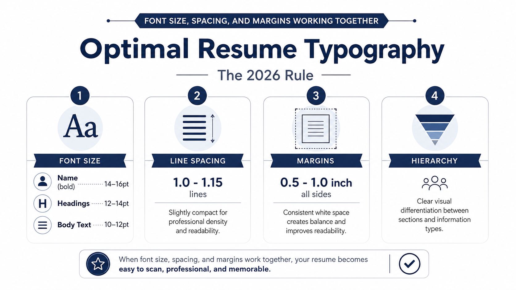
The point is not to obsess over exact numbers like a template cop. The point is to make sure the reader can find your name, scan your headings, and read your bullets without effort. Get that structure right, and the font choice becomes much safer because the page is doing its job.
Matching Font and Size to Industry and Seniority
A recent graduate applying to a corporate role and a senior executive sending a board-facing résumé should not use the same visual tone. Both need to stay ATS-safe, but the emphasis changes. That is the engineering decision here, you are tuning for context, not just picking a font that looks pleasant on screen.
Corporate, career change, and leadership each need a different feel
For entry-level and early-career corporate roles, use Calibri 11pt or Arial 11pt with straightforward headings. The document should feel organized and unfussy, because the recruiter is scanning for evidence of potential, not design taste. If the resume is thin, a slightly more open font like Arial can keep it from feeling cramped.
For a mid-career pivot, keep the same safe body font and adjust the tone with Cambria or Helvetica if the target role has a more modern or structured brand. That gives the resume a little more presence without leaving parser-friendly territory. A career switch already asks the reader to do extra work, so the typeface should stay out of the way.
For senior leaders and executives, Garamond or Cambria can work well because they read as measured and serious. As noted earlier in Microsoft's resume font guidance, Garamond fits executive positions well and Cambria suits leadership roles.
For designers, marketers, and creative professionals, you can move slightly away from the safest default and still stay sensible. Helvetica is the cleanest modern pick if you want a more design-aware feel, and it still behaves well in ATS contexts. The body font should still be easy to scan, because that is what gets read first by both software and humans.
A good test is simple. If the font looks like it belongs in a presentation slide, it does not belong in a resume. If it survives a printout, a PDF viewer, and a database import, you are in the right zone. If you want a role-specific example, Google resume formatting guidance is worth checking after you settle your typography.
Fonts and Styles That Quietly Break Your Resume
Bad font choices usually do not fail in an obvious way. They make the page feel clumsy, hard to scan, or strangely amateurish the moment a recruiter opens the file. That is why the right way to judge fonts is by categories and failure modes, not by a simple blacklist.
The problem fonts and why they fail
Decorative and script fonts create the biggest readability problems. Curlz MT, Brush Script MT, and similar novelty styles might work in a logo, but they work against a resume because they reduce clarity and can break parsing. ATS guidance warns against script, decorative, and heavily styled fonts for that reason, and that warning is the correct default.
Condensed, ultra-light, and heavily stylized typefaces create a different problem. They may still be technically legible, but they make the page feel fragile and can fall apart in digital conversion or print. The Figma resume font guide warns against unusual ligatures and graphical quirks, and that advice matches what resume software needs to read cleanly.
Straight answer: if a font makes the reader notice the font, it is usually the wrong font.
Mixing too many typefaces causes its own damage. A resume should usually use one font family, or at most two, with one font handling body text and another handling hierarchy. Once the page starts switching fonts from section to section, it looks improvised, and recruiters notice that inconsistency before they notice your achievements. Keep the system simple.
Your Pre-Export Typography Checklist
Before you export the PDF, run one last pass like a production editor, not a hopeful applicant. The goal is to catch the boring mistakes that sink an otherwise strong resume. Keep the review fast and ruthless.
Check the file like a recruiter would
- Consistent Font Choice: Use 1 to 2 professional fonts maximum, and keep body text and headings stable across the page.
- Appropriate Font Sizes: Make sure your name, headings, and body text sit in the right hierarchy, not all at the same visual weight.
- Even Line Spacing: Look for awkward gaps, squeezed bullets, or spacing that changes between sections.
- Balanced Margins: Keep enough white space on all sides so the page doesn't look crowded.
- No Widows or Orphans: Avoid single lines hanging at page breaks, they look careless.
- Export as PDF: Lock in the formatting so the file opens the same way everywhere.
If you want a quick final sanity check, use this ATS-friendly resume guide alongside your export. It's a fast way to catch formatting issues before a recruiter does.
The best resume typography is quiet. It lets your experience, skills, and trajectory take the spotlight while keeping the page clean enough for software and humans to trust. Pick the safe default, test it in PDF, and stop tweaking the font after it already looks professional.
If you want a resume that's made for the role and still clean enough to pass ATS review, visit GetTheCall. It helps you turn your existing résumé into a job-specific PDF without the formatting headaches that usually waste time. If your font is already solid, the next win is making sure the content matches the job just as cleanly.